Description
Introduction:
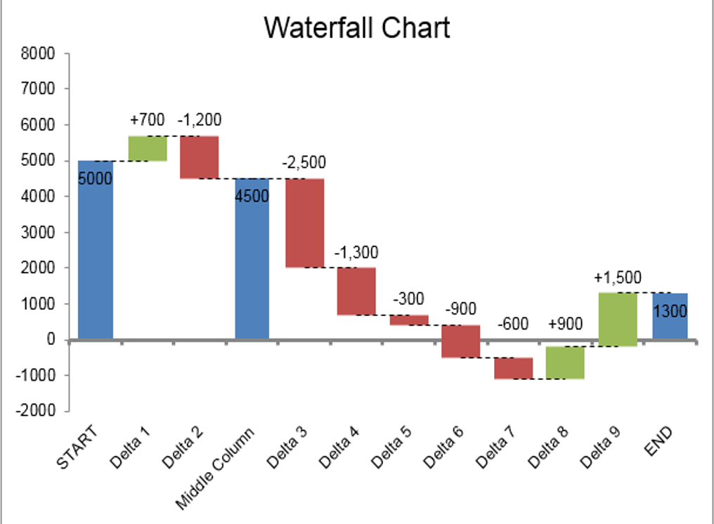
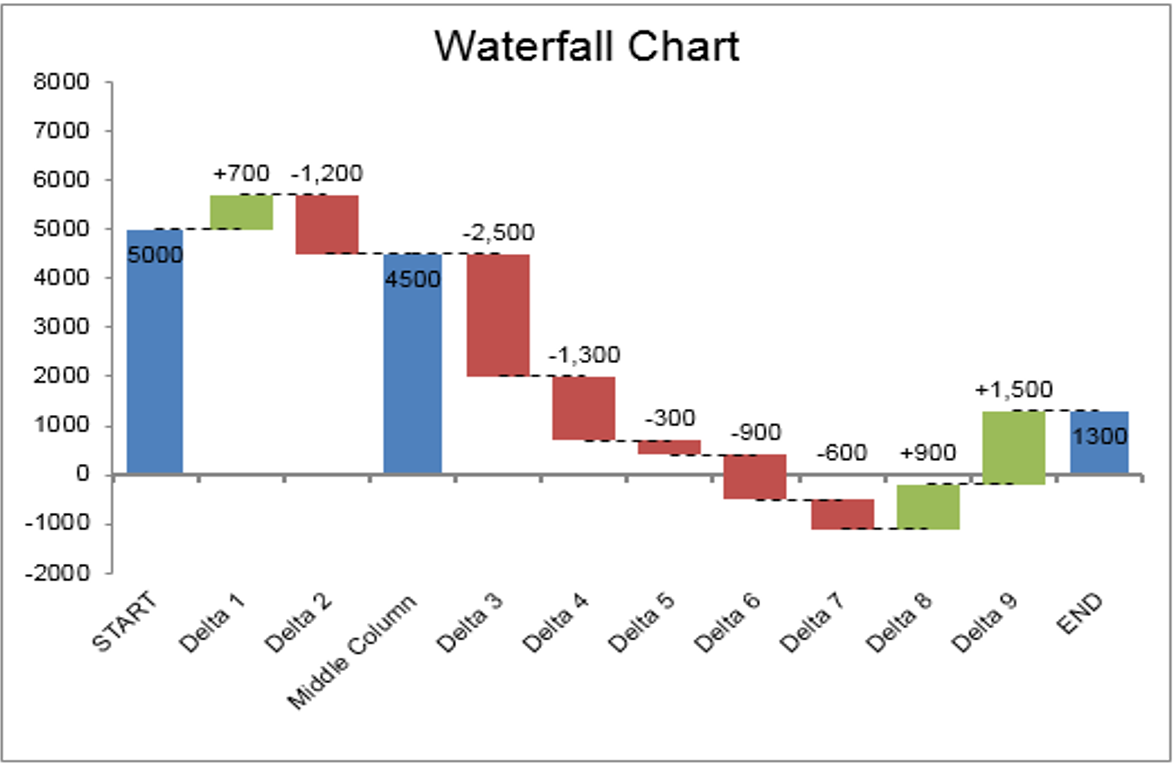
AceDigi introduces an innovative Waterfall Chart Template, providing an effective and visually compelling method to illustrate adjustments made to an initial value. This versatile chart type, also known as a Bridge Chart, proves invaluable for showcasing the breakdown of expenses, income statements, or any scenario involving adjustments leading to a final net value. The template utilizes error bars for connecting lines and stepped values, offering a unique alternative to the commonly used stacked columns or bars. In this guide, we will explore the functionalities of the template, provide step-by-step instructions, and highlight its utility in visualizing complex data scenarios.
Key Features:
- Visualization of Adjustments:
The Waterfall Chart Template excels in portraying adjustments to an initial value, presenting a clear and concise visual representation of positive and negative changes. The chart’s structure resembles a bridge, with columns representing the initial and final values and floating steps illustrating individual adjustments. This visual metaphor enhances comprehension and facilitates insightful data analysis.
- Unique Approach with Error Bars:
Unlike traditional methods involving stacked columns or bars, the AceDigi template adopts a distinctive approach by using error bars to create connecting lines and stepped values. This method simplifies the handling of negative values, providing users with a streamlined and efficient solution for constructing Waterfall Charts.
- Horizontal and Vertical Chart Options:
The template caters to user preferences by offering two separate worksheets for creating either horizontal or vertical Waterfall Charts. This flexibility ensures that users can choose the orientation that best suits their data visualization needs.
- Ease of Integration:
Once the Waterfall Chart is created, users can effortlessly copy and paste it into presentations or reports as a picture. This seamless integration enhances the accessibility and usability of the chart for diverse reporting and communication purposes.
Using the Waterfall Chart Template:
- Easy Editing of Labels and Delta Values:
Users can customize the Waterfall Chart by simply editing the Labels and Delta values. Additionally, the inclusion of an “x” in the Pillars column allows users to display intermediate values. This straightforward approach ensures that users can adapt the chart to their specific datasets with minimal effort.
- Inserting/Deleting Rows:
The template facilitates the insertion of new rows with a right-click and selection of “Insert Row.” To maintain consistency in formulas, users can then press Ctrl+D to copy all formulas from the previous row. It is essential to avoid deleting the first and last rows, ensuring the unique formulas remain intact.
- Editing Column Widths:
The width of pillars in the Waterfall Chart can be adjusted by modifying the gap percentage in the Column Chart series (or Bar Chart series for the vertical chart). Users can navigate to Format Data Series > Series Options to make these adjustments seamlessly.
- Editing Label Positions and Formatting:
Data labels are displayed using invisible stacked columns, and users have the flexibility to manually adjust label positions by dragging them with the mouse. Customization of label formats, especially for negative adjustments, involves using a custom number format to force the inclusion of a negative sign.
- Selecting Error Bars and Data Labels:
The template simplifies the selection of individual chart series, error bars, and data labels. Users can utilize the Layout tab under the contextual Chart Tools menu, selecting the desired chart element and accessing the Format Selection button for further customization.
Considerations and Further Exploration:
- Handling Negative Values:
The template’s use of error bars provides a simplified approach to handling negative values. While alternatives such as up-down bars exist, the error bar method offers a unique and efficient solution for seamless visualization of adjustments.
- Customization and Formatting:
Users are encouraged to explore customization options, leveraging the unique features of the template to align the Waterfall Chart with specific preferences. Experimenting with formatting, label positions, and column widths ensures a tailored visual representation.
Conclusion:
AceDigi’s Waterfall Chart Template emerges as a user-friendly and effective tool for visualizing data adjustments in Excel. The utilization of error bars sets this template apart, offering a streamlined approach to creating Waterfall Charts with enhanced clarity and precision. Whether illustrating income statements, expense breakdowns, or any scenario requiring a visual representation of adjustments, this template proves to be a valuable asset for data analysts, financial professionals, and anyone seeking impactful visualizations. Embrace the power of the AceDigi Waterfall Chart Template to transform complex datasets into insightful and visually engaging representations, unlocking a new dimension of data interpretation.
3. Yusuf Ali –
These templates have significantly improved the way I track my projects. User-friendly and visually appealing. Added a professional touch to my presentations. Highly recommend!
5. Omar Hassan –
Impressed with the variety of templates available. From budgeting to project management, they cover it all. Well-designed and have significantly improved my productivity. Highly recommended!
1. Ahmed Malik –
These templates have turned mundane tasks into a breeze. The attention to detail is evident, and they’ve made data analysis surprisingly enjoyable. A fantastic find!
Isabella Carter –
Impressed with the variety of templates available. From budgeting to project management, they cover it all. Well-designed and have significantly improved my productivity. Highly recommended!