
Description
Introduction:
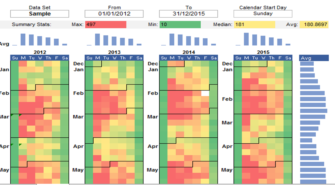
AceDigi introduces an innovative Calendar Heat Map Chart template, designed to visually represent how a dataset evolves over days, weeks, and months of the year. While Excel lacks a built-in Calendar Chart tool, this template demonstrates the creation of a Calendar Heat Map using conditional formatting. The template is a versatile solution for users seeking to analyze and visualize data trends over multiple years through color gradients. In this guide, we will explore the functionalities of the template, provide step-by-step instructions, and highlight its utility in data visualization.
Key Features:
- Visualization of Data Variations:
The Calendar Heat Map Chart serves as a powerful visualization tool, offering insights into how a dataset changes over the course of the year. This visual representation facilitates the identification of patterns, trends, and fluctuations in the data, making it valuable for diverse applications.
- Conditional Formatting Methodology:
The template employs conditional formatting techniques to create the Calendar Heat Map. Conditional formatting allows users to assign different colors to cells based on the values they represent. By utilizing this method, the template achieves a dynamic and visually appealing representation of data variations.
- User-Friendly Template Structure:
The template is structured for user convenience, with a clear separation of worksheets for Data, 4-Year analysis, and 1-Year analysis. Users can easily input their dataset into the Data worksheet, and the subsequent worksheets provide options to analyze the data over different time frames, enhancing flexibility and adaptability.
- Customization Options:
Users have the flexibility to use the template as-is by pasting their data into the Data worksheet, or they can customize it further by defining their own conditional formatting rules. This adaptability allows users to tailor the visualization to suit their specific data analysis requirements.
How to Use the Template:
- Prepare Your Data:
The initial step involves preparing a dataset with a list of unique dates in one column and corresponding numeric values in a second column. While multiple columns of data can be used, the template analyzes one column of data at a time. The guide emphasizes the use of a Pivot Table for quick data formatting, especially when dealing with multiple transactions on the same dates.
- Copy Your Data Into the Template:
Once the data is prepared, users can seamlessly copy and paste it into the Data worksheet of the template. To maintain data integrity, it is recommended to use the Paste Special > Values option, avoiding the inclusion of unnecessary formulas and formatting.
- Choose a Data Set and Date Range:
In the 4-Year and 1-Year worksheets, users can select the Data Set they want to analyze from a drop-down list. This list is dynamically generated from the column labels entered in the Data worksheet, offering a user-friendly approach to data selection.
Considerations and Further Exploration:
- Pivot Table for Data Preparation:
The guide emphasizes the use of a Pivot Table for preparing data, especially when dealing with multiple transactions on the same dates. The Pivot Table facilitates the creation of a dataset with unique dates, representing the sum of all transactions for each date.
- Customization and Conditional Formatting:
Users are encouraged to explore customization options, either using the template as-is or defining their own conditional formatting rules. This flexibility ensures that the Calendar Heat Map aligns with specific data analysis preferences and requirements.
Conclusion:
AceDigi’s Calendar Heat Map Chart template emerges as a dynamic and efficient tool for visualizing data variations over time in Excel. By leveraging conditional formatting techniques, the template transforms datasets into vibrant visual representations, making it easier for users to discern patterns and trends. The structured approach, customization options, and user-friendly interface contribute to the template’s effectiveness in data visualization. As organizations and individuals seek to derive actionable insights from their data, the AceDigi Calendar Heat Map Chart template stands as a valuable resource for enhancing data analysis and decision-making processes. Embrace the power of visual representation with this template to unlock new perspectives on your datasets.
5. Omar Hassan –
The templates provided are a lifesaver! Easy to use and have improved my organization significantly. Versatile and suitable for various tasks. Kudos to the creators!
Liam Walker –
The templates provided are a lifesaver! Easy to use and have improved my organization significantly. Versatile and suitable for various tasks. Kudos to the creators!
Oliver Mitchell –
Using these templates for a few months now, and they’ve exceeded my expectations. Intuitive and time-saving. Highly valuable for anyone looking to simplify their tasks.”
Sophia Williams –
Top-notch templates! Cover a wide range of needs with impressive attention to detail. Improved the professionalism of my reports and presentations. Highly satisfied!