Description
AceDigi Cause and Effect Diagram: A Comprehensive Guide
The Fishbone Diagram, also known as the Ishikawa Diagram or Cause and Effect Diagram, derives its name from its resemblance to a fish skeleton. It is a widely-used tool for cause and effect analysis, aiding in the identification of potential causes for a specific problem or event. In this comprehensive guide, we will delve into the intricacies of creating and utilizing a Fishbone Diagram, utilizing an AceDigi template. Additionally, we will explore the steps involved in a cause and effect analysis and shed light on the distinctions between categorization and causality within the diagram.
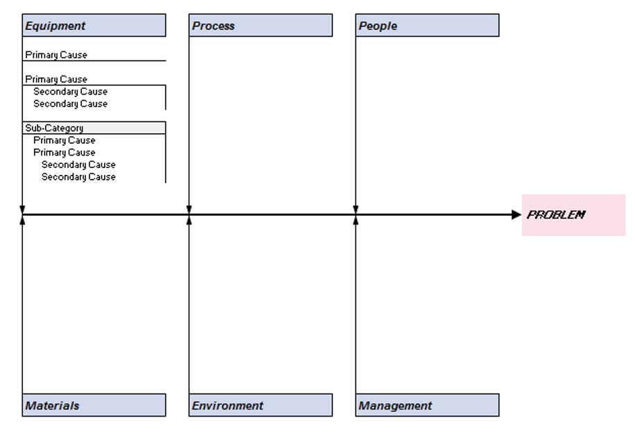
AceDigi Fishbone Diagram Template
The AceDigi Cause and Effect Diagram template presented here offers a user-friendly approach to creating a cause and effect diagram using a spreadsheet. Unlike traditional fishbone diagrams, this template simplifies the editing and customization process, eliminating the need for constant adjustment of text boxes and arrows.
Key Features of the Template:
- Cell Formatting: Easily add or remove branches to the diagram using cell formatting.
- Insert Rows: Increase space for primary causes by inserting rows.
- Text Indenting: Use text indenting within a cell for secondary or tertiary causes.
- Copy and Paste: Duplicate columns to insert more categories.
The accompanying Outline worksheet in the workbook further streamlines the editing process by organizing the diagram into an outline view, facilitating on-the-fly modifications.
Using a Cause and Effect Diagram
The primary objective of a cause and effect analysis is to pinpoint the causes, factors, or sources of variation leading to a specific event, result, or defect in a product or process. The Fishbone Diagram serves as a valuable tool alongside brainstorming and the 5 Whys technique.
Steps to Using a Cause and Effect Diagram:
- Define the Effect: Clearly articulate the specific effect or problem under consideration.
- Choose Categories: Select relevant categories. While the template includes common categories, customization is possible.
- Brainstorm Possible Causes: Utilize the diagram during brainstorming sessions to explore causes within each category.
- Ask Why?: Employ the 5 Whys technique to delve into root causes by repeatedly asking “Why?” or “Why else?”
- Investigate: Confirm potential causes by gathering data.
- During Brainstorm Sessions: The diagram is often used loosely during brainstorming sessions, with branches representing sub-categories or causality.
- Primary and Secondary Causes: Distinguish between primary causes (directly leading to the effect) and secondary causes (leading to primary causes).
- Categorization vs. Causality: Recognize the difference between categorizing possible causes and establishing causality within the diagram.
- Sub-Categories: If using sub-categories, circle them to indicate their distinction from primary causes.
Categorization vs. Causality
The Fishbone Diagram can be employed for both categorizing possible causes and representing causality. Understanding the distinction is crucial for effective utilization.
Categorization:
– Grouping causes under main categories (Equipment, People, etc.).
– Sub-categories, if used, are circled to emphasize categorization.
Causality:
– Establishing direct links between causes, differentiating primary and secondary causes.
– A tree diagram or root cause analysis aligns more closely with thinking in terms of causality.
Conclusion
In conclusion, the AceDigi Cause and Effect Diagram serves as a powerful tool for cause and effect analysis. Its simplicity and versatility make it ideal for collaborative brainstorming sessions. By following the outlined steps and understanding the nuances of categorization and causality, teams can effectively identify and address the root causes of issues, contributing to continuous improvement in processes and products.
Henry Taylor –
The templates provided are a lifesaver! Easy to use and have improved my organization significantly. Versatile and suitable for various tasks. Kudos to the creators!
Benjamin Harrison –
Must-have for anyone working with data. Functional and aesthetically pleasing. An integral part of my workflow, making data management a breeze.
5. Omar Hassan –
These templates are a lifesaver for someone like me who’s always on the go. Quick, easy, and efficient – they’ve become an essential part of my toolkit. Thumbs up!
Certainly! Here are five Muslim names: –
I stumbled upon these templates and couldn’t be happier. They’re like a secret weapon for productivity. The range is impressive, and the simplicity of use is refreshing