Description
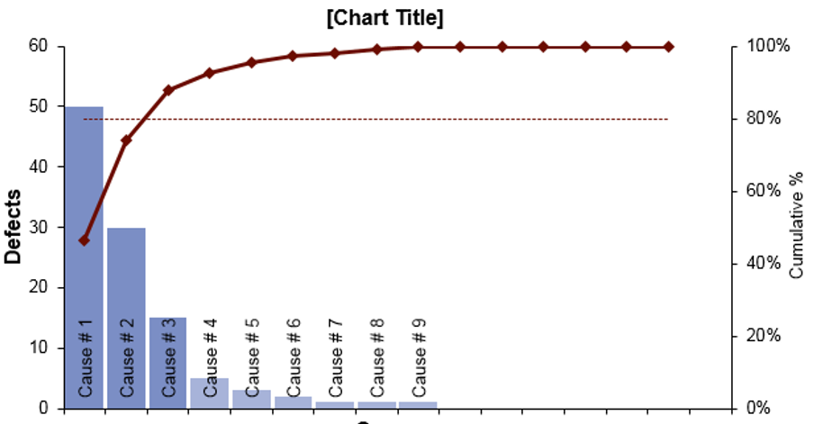
AceDigi Pareto Chart: Unleashing the Power of Prioritization
The AceDigi Pareto Chart, a formidable tool in quality control, takes inspiration from the legendary economist Vilfredo Pareto (1848-1923). This insightful tool, a crucial component of Pareto Analysis, aids in visually pinpointing the most vital factors, common defects, or prevailing problems, often referred to as “the vital few.” In this comprehensive exploration, we’ll delve into the nuances of the AceDigi Pareto Chart Template, specifically designed for seamless integration with Excel or Google Sheets, presenting a user-friendly and intuitive approach to traditional methods.
Understanding the AceDigi Pareto Chart
Unveiling the Pareto Chart
The Pareto Chart, alternatively known as the Pareto Diagram, stands as a distinctive bar chart. Its uniqueness lies in the arrangement of values from largest to smallest, coupled with a superimposed line graph illustrating the cumulative total. Within the realm of Pareto Analysis, a critical technique in quality control, attention is drawn to the point where the line graph intersects the 80% mark. Categories to the left of this intersection represent the “vital few” or the most impactful factors.
AceDigi Pareto Chart Template Overview
This meticulously crafted spreadsheet template automates the creation of a Pareto Chart as you input different factors. Tailored for swift Pareto Analysis, it efficiently identifies significant causes, defects, or problems. The template, designed as a professional Pareto analysis report, is primed and ready for printing, ensuring a seamless and polished presentation of your findings.
Pareto Analysis Unveiled
The Pareto Principle
Central to the Pareto Chart is the Pareto Principle, commonly known as the 80-20 Rule. This rule of thumb suggests that 80% of effects stem from 20% of causes. Originating from Vilfredo Pareto’s observation in Italy, where 80% of land was owned by 20% of the population, this principle has found application in various business domains. Dr. Joseph M. Juran, a 20th-century quality management advocate, coined the phrase “the vital few and the useful many” to articulate the essence of the 80-20 rule.
Applications of the Pareto Principle
The Pareto Principle finds relevance in diverse business scenarios:
Customer Complaints: Identifying that 80% of complaints arise from 20% of customers.
Management: Acknowledging that 80% of results emanate from 20% of the group.
Sales: Recognizing that 80% of profits are generated by 20% of products.
Quality Management: Pinpointing that 80% of problems stem from 20% of causes.
While a Pareto Chart expedites the identification of significant factors, the decision on which problems to address may necessitate a cost-benefit analysis. Optimal solutions often lie in addressing factors with significant impact, balanced against associated costs.
The “Useful Many”
Traditionally labeled as the “trivial many,” Dr. Juran later coined the term the “useful many.” While seemingly insignificant, these factors warrant attention. A factor contributing only 3% of problems may offer a straightforward and cost-effective solution — a “just do it” scenario. Furthermore, seemingly inconspicuous causes may reveal correlations with major issues, providing valuable insights into problem resolution.
Navigating Pareto Analysis in Customer Complaints
In Pareto Analysis involving factors both general and specific, such as customer complaints, attention to the “Useful Many” or the “Long-Tail” factors is crucial. Specific complaints within the “tail” may illuminate root causes for more general complaints. For instance, a response like “Don’t Have Excel” may correlate with the general complaint “Can’t Open the File,” revealing the root cause as “Don’t Have Excel.”
Utilizing the AceDigi Pareto Chart Template
Sorting Values in Descending Order
While the Pareto Analysis worksheet does not automatically sort data from largest to smallest, the template is designed for easy sorting. By selecting the entire range of causes and defects and using the “Sort” function, data can be arranged in descending order by defects, streamlining the analysis process.
Adding/Deleting Categories
Formulas in the data-entry table below the chart ensure easy deletion or insertion of rows without disrupting calculations. Inserting rows below the first line or above the last line in the table seamlessly expands references to incorporate new data, maintaining the template’s integrity.
Changing Labels
The labels for the x-axis and y-axes in the chart are dynamically linked to column headers in the table below. Users can effortlessly customize column headers to align with specific contexts, enhancing the chart’s relevance.
Unique Features
The AceDigi Pareto Chart Template boasts unique features for enhanced usability:
Highlighted Bars: Distinguishing bars for the “vital few” with a different color facilitates easy identification of the most significant factors.
Cumulative % Cutoff Customization: Users have the flexibility to choose their cumulative percentage cutoff, deviating from the standard 80%, catering to specific analytical requirements.
Readable Category Labels:** Thoughtful alignment of category labels over the top of bars accommodates descriptive names, ensuring easy interpretation while optimizing space usage.
Conclusion
In conclusion, the AceDigi Pareto Chart Template emerges as a sophisticated yet user-friendly tool for Pareto Analysis. Empowering users to swiftly identify and prioritize significant factors, it stands as a valuable asset in quality control and decision-making processes. As businesses navigate complexities, the AceDigi Pareto Chart offers a clear path towards efficiency and informed decision-making.
Amit Modi –
These templates are a lifesaver for someone like me who’s always on the go. Quick, easy, and efficient – they’ve become an essential part of my toolkit. Thumbs up!
Oliver Mitchell –
Using these templates for a few months now, and they’ve exceeded my expectations. Intuitive and time-saving. Highly valuable for anyone looking to simplify their tasks.”
Navdeep Yadav –
These templates are a lifesaver for someone like me who’s always on the go. Quick, easy, and efficient – they’ve become an essential part of my toolkit. Thumbs up!
3. Yusuf Ali –
Must-have for anyone working with data. Functional and aesthetically pleasing. An integral part of my workflow, making data management a breeze.